UX + UI DESIGN
WEBSITE
STUDY CASE
Zeit is a subsidiary of Richard Branson’s Virgin empire. After a long struggle with Elon Musk, Virgin has been able to make time travel tourism available to all of us. Zeit is looking at you to design their new brand and set up an e-commerce responsive website so they can sell travel packages and tickets to different times.
INTRODUCTION
MY ROLE
Solo UX + UI designer
THE TEAM
I collaborated closely with my Designlab uXacademy mentor.
TIMELINE
Approximately 80hrs
THIS IS A STUDY CASE
This case study was conducted while attending UX Academy at Designlab. It was part of the curriculum and completed under the supervision of a mentor.
PROBLEM STATEMENT
Creating a User-Friendly time travel booking site.
BREAKDOWN OF THE PROBLEM
Different users have varied interests and preferences for travel destinations and historical periods. Effectively communicating the appeal of Zeit's diverse time travel options on a single platform can be challenging.
🌐 Building Trust and Credibility
As a new venture in the market, establishing trust and credibility is vital for Zeit. Prospective travelers need assurance that time travel is safe, reliable, and well-organized, and that Zeit is a reputable provider of these extraordinary experiences.
💼 User Interaction and Habits
Understanding how users currently interact with existing travel booking platforms is key. Analyzing these interactions will help tailor Zeit's website to meet users' expectations and improve their overall experience.
⏳ Complexity of Time Travel
Time travel is a novel and complex concept for most users. It is crucial to clearly explain how time travel works, ensuring users understand the safety protocols and highlight the unique aspects of each destination without overwhelming them.
📱 Responsive Design Requirements
The website must be fully responsive, providing a seamless experience across devices. Ensuring consistency and usability across different platforms is essential for user satisfaction.
🗓️ Unique Selling Proposition
Defining and conveying what makes Zeit's time travel offerings unique compared to traditional travel experiences is essential. This includes highlighting the historical significance, exclusive activities, and the novelty of traveling through time.
PROBLEM STATEMENT
Addressing bias in time travel.
RESEARCH
Creating a Research Plan
PROCESS
Competitor Analysis
I focused on five platforms: Airbnb, National Geographic Expeditions, SpaceX, Booking.com, and Culture Trip. The evaluation centered on their unique travel experiences, key features, user experience, and design aesthetics.
Actionable Insights:
Clear and Modern UI/UX Design - Adopt a simple, modern design with intuitive navigation and search functionalities similar to Airbnb and Booking.com.
Comprehensive Information and Guided Experiences - Provide detailed information about each destination and include guided tour options, inspired by National Geographic Expeditions.
Unique and Engaging Content - Highlight Zeit's unique time travel experiences with engaging descriptions, high-quality images, and videos, following Culture Trip's model.
Trust and Credibility - Emphasize safety protocols, provide testimonials, and showcase endorsements to build trust.
Responsive and Accessible Design - Ensure the website is fully responsive and accessible on all devices, similar to Airbnb and Booking.com.
Flexible Booking and Customization - Offer customizable travel packages with flexible booking options, inspired by various competitors.
Innovative and Informative Messaging - Communicate Zeit's unique selling points with compelling storytelling, similar to SpaceX.
By contemplating these insights, Zeit can be a user-friendly e-commerce platform that meets industry standards and exceeds user expectations.
PROCESS
Understanding user diversity
Understanding, the goals and pain points of different user groups can allow me to conduct effective user interviews. Zeit's provisional personas include the Novice, who needs travel guidance; the Culture Geek, who seeks historical experiences on a budget; the Backpacker, who is budget-driven and adventure-focused; the World Trotter, an experienced traveler seeking meaningful experiences; and the Opulent, who demands high-end, customized experiences.
These provisional personas ensure Zeit's user interviews address a range of users.
PROCESS
User interviews
Through user interviews for Zeit, several key findings emerged that should directly shape the website's design and functionality. Participants, who travel multiple times a year, expressed the need for diverse trip options with varying lengths and budgets. They prioritize detailed destination information and flexible pricing, similar to platforms like Skyscanner and Airbnb. This insight suggests the website should offer a wide range of trip options, clearly categorized by cost and duration, to cater to different financial capabilities and travel preferences.
Users also highlighted their preference for using desktop computers for booking and mobile devices for on-the-go searches. The need for culturally immersive experiences was a recurring theme, indicating that the website should feature-rich content.
Simplifying the booking process was another critical finding. Users expressed frustration with lengthy booking procedures and stressful airport experiences. Zeit website should streamline the booking process, minimizing the steps required to complete a reservation and provide clear information about the safety procedures of time travel.
These findings underscore the importance of a user-centered approach in designing the Zeit website, focusing on flexibility, detailed information, ease of use, and safety assurances to create an engaging and reliable platform for time travelers.

PRODUCT PERSONA
Meet Ella
I created Ella Carter to represent our primary user group: adventurous, culture-driven travelers who value spontaneity and authentic experiences. By focusing on a single, detailed persona, I could hone in on specific needs, frustrations, and motivations common among this demographic.
PROCESS
Emphaty map
To connect with Ella Carter, this empathy map was created. It reveals her preference for a user-friendly, detailed ZEIT website to book diverse, culturally rich trips. Excited about time travel but concerned about safety and complexity, Ella's reliance on research and reviews shows her need for reliable information, and her frustrations with complex booking highlight her desire for a seamless travel experience.
INFORMATION ARCHITECTURE
Aligning goals through Information Architecture
PROCESS
Project Goals
The Zeit project aimed to align company goals with user needs, focusing on market expansion and brand strength. Key insights emphasized user-centric features like intuitive navigation and responsive design for a safe, engaging experience.
PROCESS
Feature Roadmap
The Zeit project's features roadmap prioritized key functionalities based on user needs and research. Insights highlighted the importance of secure checkout and personalized experiences to boost user satisfaction.
PROCESS
Card Sorting Study
The card sorting study helped identify how users categorize time travel destinations. Participants primarily organized destinations by historical periods, indicating a preference for time-focused navigation, which will enhance the site's user experience.
PROCESS
Site map
The sitemap visualizes Zeit's website structure for logical, user-friendly navigation. It highlights the importance of easy access to key features like safety information, booking, and customer support, ensuring users can find information efficiently.
PROCESS
User flow - Booking a trip
The user flow maps the steps for booking a trip on Zeit, ensuring a seamless experience. It highlights the need to simplify account creation and payment steps to enhance user satisfaction and efficiency.

PROCESS
Sketches
The sketches were created to explore layout options and visual elements to capture user attention and facilitate easy navigation. The designs helped identify effective ways to present information and interactive features. An insight gathered from this process is the importance of balancing visual appeal with functionality, ensuring the design is both engaging and user-friendly
PROCESS
Wireframes
The wireframes for the Zeit project were created to outline the structure and functionality of the homepage, ensuring a user-friendly and visually appealing design.
The search bar is prominently placed to facilitate easy trip planning, and the timeline feature helps users explore destinations by historical periods, reflecting insights from user preferences for time-focused categorization.
Sections like "Get Inspired" and "About Safety" are designed to engage users and build trust, highlighting curated destinations and safety information. These design choices were informed by the research and IA, aiming to enhance the user experience and meet business objectives.
Home page
More wireframes:

UI DESIGN
Crafting a Modern, Futuristic UI for Zeit
PROCESS
Style tile
The style tile for Zeit encapsulates the brand's visual language, aligning with its modern, futuristic, and professional ethos. The mood board conveys Zeit's core message through imagery of iconic landmarks, emphasizing a sense of timelessness and trust.
The choice of Panchang and Poppins typefaces reflects a balance between contemporary aesthetics and readability. The color palette, featuring primary brand colors like deep reds and muted blues, reinforces the brand's identity while ensuring a cohesive and visually appealing UI.
This deliberate design strategy supports the overall user experience, making it intuitive and engaging.
PROCESS
UI kit
The UI kit for Zeit exemplifies a strategic approach to creating a seamless user experience. The kit includes UI elements such as buttons, sliders, checkboxes, and input fields, each designed with consistent spacing and alignment to maintain a clean and modern aesthetic.
The choice of red for interactive elements like sliders and switches draws user attention to critical actions and states, enhancing usability and engagement. Additionally, the icons and social media elements are designed to integrate seamlessly, reinforcing Zeit’s brand identity and ensuring a professional look and feel throughout the interface.
This thorough and well-considered design approach supports the goal of making Zeit's digital experience intuitive and visually appealing.
UI DESIGN
Crafting a Modern, Futuristic UI for Zeit

IMPLEMENT AND ITERATE
Iterative Design: From Prototype to Perfection
PROCESS
Prototype
A clickable prototype was developed to test the design's functionality and user interaction. For example, an intuitive menu system was implemented to facilitate easy navigation, based on user research highlighting the need for straightforward access to different sections. A timeline navigation feature was developed to confirm the research assumption that users valued a clear and accessible way to explore chronological information.
The goal of the prototype was to gather user feedback on these interactions and others, allowing for necessary adjustments before the final implementation.

PROCESS
Usability Testing
PROCESS
Guided test
I directed participants through specific tasks within the clickable prototype to observe their interactions and gather feedback. This structured approach ensured that all participants followed a consistent path, allowing for a focused evaluation of key interactive elements. The guided nature of the test provided a controlled environment to closely monitor user behavior, identify usability issues, and confirm that the design met the intended goals.
PROCESS
Unguided test (Useberry)
The participants interacted freely with the clickable prototype without specific instructions, simulating a natural user experience. This approach was crucial for identifying how users navigate and utilize the platform on their own.
PROCESS
The results
The results of both guided and unguided tests provided comprehensive insights into the usability and effectiveness of the design. In the guided tests, participants successfully navigated the prototype, completing specific tasks such as locating historical events on the timeline with a high success rate. This confirmed the intuitiveness of key features like the timeline navigation, although some users found the orientation initially confusing, prompting a redesign for clarity.
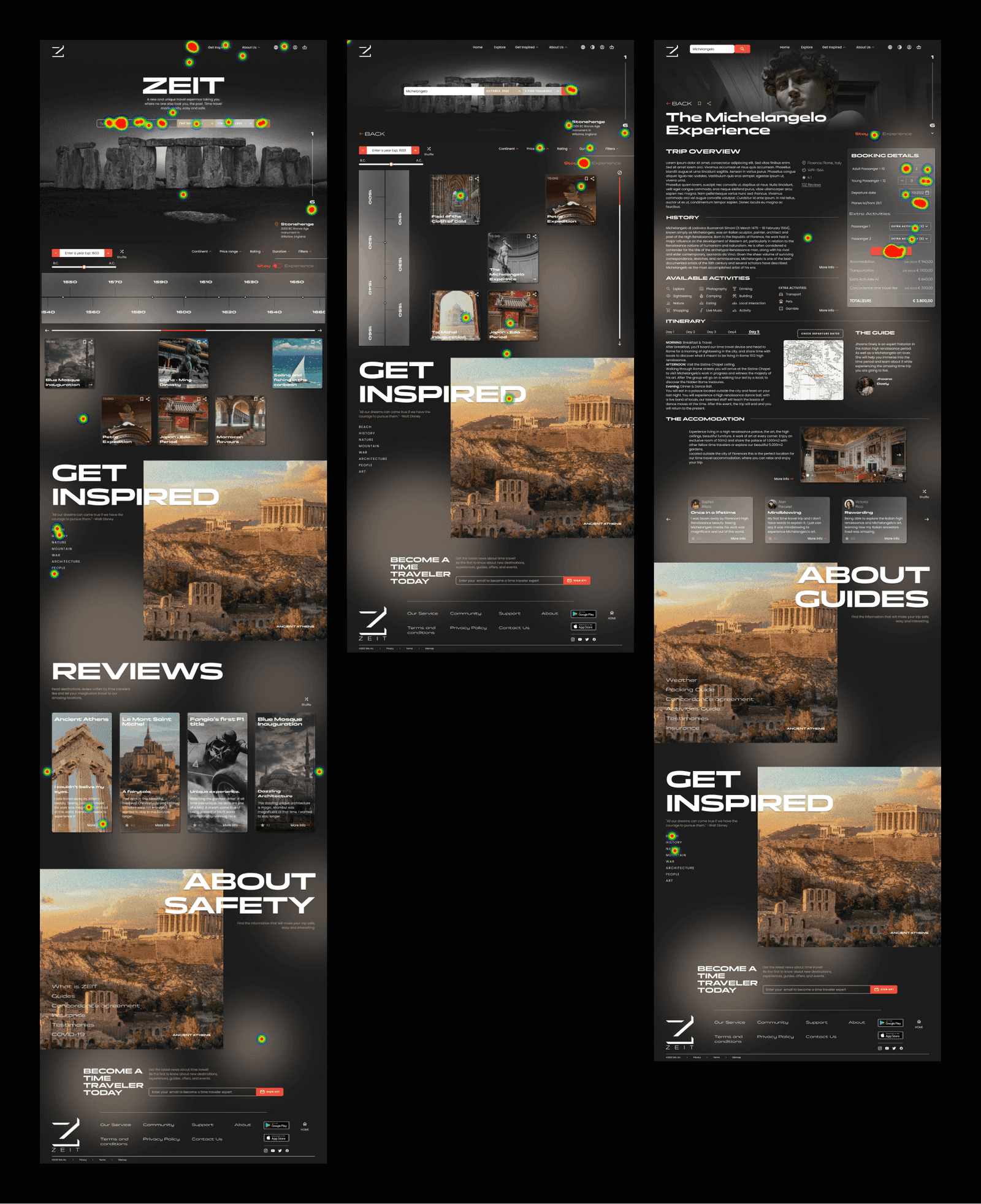
In the unguided tests, users explored the prototype freely, achieving a 100% filter rate and revealing natural user behaviors. For example, users intuitively used the filter options to narrow down their searches and engaged with the content in a way that aligned with the design's intent. The average completion time of 42.9 seconds (task 1 ) and 3 minutes 50.2 seconds (task 2 ) indicated that users could efficiently navigate and complete tasks without guidance.
These combined insights highlighted specific areas for improvement, such as refining the timeline orientation and enhancing the clarity of certain interactive elements, ultimately validating the overall design and ensuring it met user needs effectively.
PROCESS
Affinity map
I organized user feedback from both guided and unguided tests into thematic clusters to identify patterns and insights. This helped categorize user comments and observations, revealing key areas for improvement and validation. For example, users appreciated the clear navigation and found the timeline feature engaging, confirming its value in exploring chronological information.
However, some participants struggled with the timeline orientation, highlighting the need for redesign. The affinity map also uncovered a preference for simplified filter options, which informed subsequent design iterations. By mapping these insights, I could prioritize solutions that enhanced the overall user experience.

IMPLEMENT AND ITERATE
Iterative Design: From Prototype to Perfection

Project reflections and observations:


