PRODUCT DESIGN
WEBAPP
PROFESSIONAL
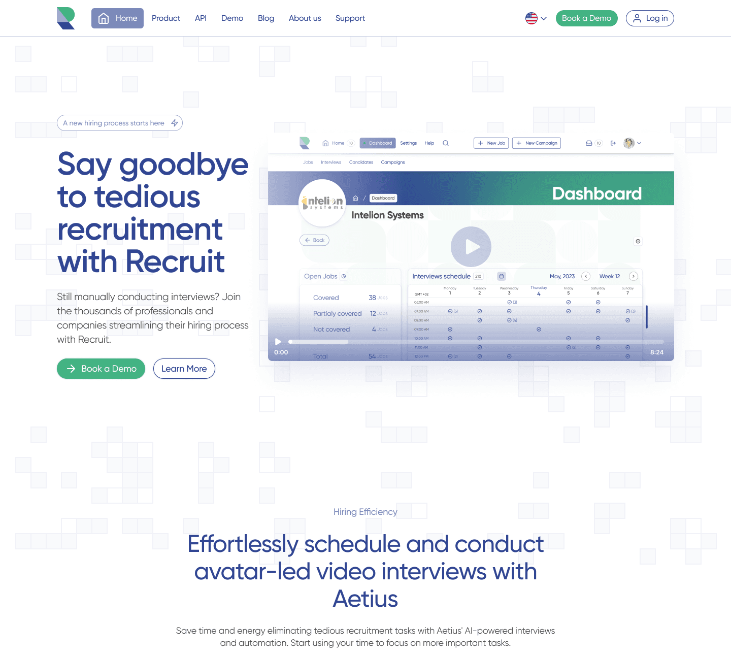
Recruit is an advanced platform solution powered by artificial intelligence, specifically designed to revolutionize talent acquisition processes. With over four years of research and development invested in AI technologies, Recruit is introducing a new recruitment method featuring advanced automation and sophisticated data analysis.
INTRODUCTION
MY ROLE
Solo Product Designer
THE TEAM
I collaborated with developers and the product manager, reporting directly to the VP.
TIMELINE
Approximately 6 months
NDA NOTICE
Due to an NDA with the client, the details shared here are limited to what is permissible.
PROBLEM STATEMENT
Designing a Better Recruit
BREAKDOWN OF THE PROBLEM
👫 Diverse User Needs
The Recruit platform caters to a broad spectrum of users, including recruiters, hiring managers, and candidates, each with distinct needs and expectations. Designing an interface that meets these varied requirements while maintaining a cohesive and intuitive user experience poses a significant challenge.
🧑💻 Enhancing Usability
The old UI and UX lacked intuitiveness and accessibility, which hindered users from fully leveraging the platform's capabilities. Improving the usability and clarity of design elements, layouts, and overall user journeys is crucial for maximizing the platform's effectiveness.
🔄 Consistency Across the Platform
Maintaining a consistent design language and user experience across different sections of the platform is vital. Inconsistencies can confuse users and disrupt their workflow, reducing overall satisfaction and efficiency.
⚙️ Complex Feature Set
The wide range of functionalities, candidate evaluation, automated interview scheduling, and deep insights into candidate fit. Simplifying these complex features and presenting them in an accessible manner is essential to prevent user overwhelm and ensure effective usage.
📈 Driving Engagement and Adoption
To ensure that users actively engage with and adopt the Recruit platform, the redesign must address existing pain points and provide a seamless, user-friendly experience. This involves continuous user feedback integration and iterative improvements.
PROCESS
Shaping efficient UX strategies.
This is an old screen design of the Recruit app, exported from a Figma design file.
THINK
Foundational insights: Ground research in Lean UX.
THINK
Competitor Analysis
The competitor analysis for the Recruit platform's redesign evaluated MyInterview, SparkHire, and HireVue, focusing on their UI/UX designs to inform improvements. MyInterview excels with a user-friendly interface and well-organized Kanban boards for tracking applicants, enhancing user experience. SparkHire offers flexible video interview options and team collaboration features, though navigation and feature accessibility could be better. HireVue provides comprehensive AI-powered tools and detailed analytics, but its interface can be overwhelming, necessitating streamlined features for a better user experience.
These insights guided Recruit's redesign to prioritize a more intuitive, streamlined, and user-centric platform, meeting and exceeding user expectations.
THINK
UI/UX Audit
The UI/UX audit of the Recruit platform's existing design revealed several critical areas needing improvement. The audit highlighted like layout and hierarchy challenges, unclear button placements, and inconsistent design elements. The existing design lacked intuitive navigation, making it difficult for users to find and understand the interface's structure. Button placements were often non-intuitive, hindering smooth user interactions. Additionally, certain interactive elements, like dropdown menus and input fields, were unclear, leading to confusion about their functionality.
Consistency issues were prevalent, with recurring design flaws, contributing to a disjointed user experience. Specific functional problems, such as error message placements and the need for more descriptive labels, further complicated user interactions. Addressing these issues in the redesign was essential to create a more intuitive, user-friendly, and effective platform.
THINK
Stakeholder interviews
The stakeholder interviews conducted for the Recruit platform redesign provided crucial insights and specific requirements for enhancing the UI/UX. Engaging with key team members, including developers, product managers, and the VP, we identified the primary objectives and pain points from their perspectives. Key requirements included updating the UX to ensure it aligns with contemporary design standards, improving the overall user journey, and enhancing the visual appeal to attract and retain users. Stakeholders emphasized the need for a cohesive and consistent design language across the platform.
These insights were instrumental in shaping the redesign strategy, ensuring that the new UI/UX would meet the functional needs and aesthetic expectations of both the users and the stakeholders.
Transformative UI / UX Hypotheses
This is an old screen design of the Recruit app, exported from a Figma design file.
Personas
Meet Sarah

A 35-year-old senior recruiter at a mid-sized tech company. Sarah has been in the recruitment industry for over 10 years and excels in identifying top talent for various technical roles. Her primary responsibilities include sourcing candidates, conducting interviews, and collaborating with hiring managers to fill critical positions. Sarah is tech-savvy and values tools that streamline her workflow. She spends a significant portion of her day navigating different recruitment platforms, managing job postings, and tracking candidate progress. Sarah needs an intuitive and efficient system that allows her to quickly assess candidate profiles, schedule interviews, and generate insightful reports. The platform's user interface must be straightforward and responsive, enabling her to perform her tasks with minimal friction. Her ultimate goal is to enhance the hiring process, ensuring a smooth and productive experience for both the company and the candidates.
Meet Alex

A 28-year-old software engineer looking for new opportunities in the tech industry. Alex has five years of experience in full-stack development and is passionate about working with innovative technologies. Currently employed but seeking a more challenging role, Alex values platforms that offer a seamless job application process. He spends his evenings and weekends browsing job boards, applying for positions, and preparing for interviews. Alex appreciates detailed job descriptions, clear application instructions, and transparency in the hiring process. He prefers platforms that allow him to upload his resume easily, track the status of his applications, and receive timely feedback. For Alex, a positive user experience means not having to navigate through complex menus or deal with technical glitches. His ideal recruitment platform provides personalized job recommendations, simplifies interview scheduling, and offers insightful preparation tips, ultimately helping him land his dream job.
MAKE
Make, Test, Perfect
MAKE
Wireframes foundations
The creation of the wireframes was a pivotal step in the redesign process. This phase focused on translating the conceptual ideas and user requirements into tangible visual elements. Guided by the insights collected from competitive analysis, the UX/UI audit, and stakeholder interviews, I aimed to create a user-friendly and efficient interface.
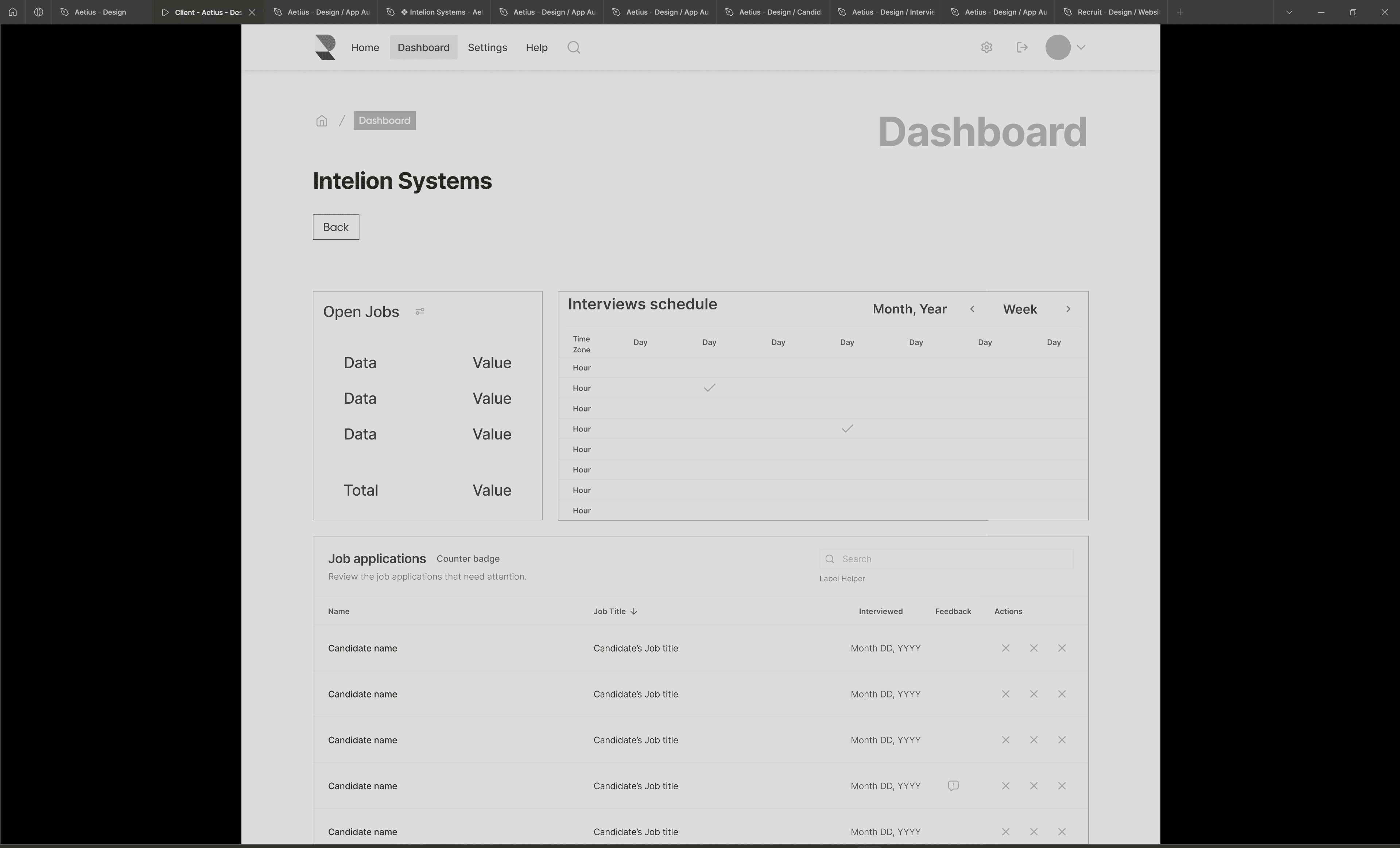
This wireframe showcases the essential layout and functionality of the Recruit platform's dashboard.
The dashboard provides a comprehensive view of all critical data points, including open job positions and their corresponding values. This high-level summary allows recruiters to assess their current recruitment status.
Interviews Schedule:
The interview schedule is presented in a calendar format, allowing users to view interviews by day, week, or month. This feature ensures recruiters can efficiently manage their time and resources, scheduling interviews without conflicts.
Job Applications:
This section includes a detailed list of job applications, displaying candidate names, job titles, interview dates, feedback status, and actions that can be taken. The pagination at the bottom of the section ensures that large volumes of applications can be easily navigated.
Actionable Insights:
Each application entry provides actionable insights, such as whether a candidate has been interviewed and received feedback. This enables recruiters to identify and focus on applications that require immediate attention.
The objective of the wireframes was to establish a foundational structure that could be quickly iterated upon and by creating low-fidelity wireframes, I prioritized speed and agility.

MAKE
Figma Prototyping
After creating wireframes, the next step in the Recruit platform redesign was developing interactive prototypes. This phase translated selected wireframes into dynamic, clickable models for rapid testing and iteration guided by insights from competitive analysis, UX/UI audits, and stakeholder interviews. The prototypes enabled dynamic engagement, allowing detailed feedback on interactions and design.
Simulated user scenarios helped identify and fix usability issues, while the Lean UX approach focused on quick iterations and feedback loops. Prototypes facilitated stakeholder and developer collaboration through interactive sessions and gradually transitioned approved designs to high-fidelity designs. The primary objective was to validate design solutions swiftly and efficiently through collaboration and user-centric design.
Designing intuitive experiences for Recruiters and Candidates
MAKE
Scalability and Flexibility
Scalability and flexibility were crucial considerations. The designs needed to accommodate future updates and features, which involved creating a modular system that could be easily expanded. This approach ensured that the platform could evolve without compromising design integrity.
Key elements such as "Interviews schedule," "Open Jobs," "Overview," and "Job applications" are designed as distinct modules. This modular design allows each section to be independently updated or expanded without disrupting the overall layout and functionality. For instance, new features can be added to the "Interviews schedule," or additional metrics can be included in the "Overview" section seamlessly. This ensures the platform can evolve, incorporating new functionalities while maintaining design integrity and user experience.
Before feedback:
After feedback:
MAKE
Transforming feedback
Collaboration with stakeholders and developers was integral to the process. Regular feedback sessions and interactive reviews helped align the designs with technical constraints and business goals. This iterative, collaborative approach enabled us to address concerns early and refine the designs efficiently.
Comparing the initial and final versions of the interview summary reveals significant design improvements. The feedback led to adjustments in data display, shifting from a detailed play-by-play of the entire interview to a summary with vital interview moments. The final designs feature a cleaner, more organized layout with prominent metrics. These changes improved usability and ensured alignment with the brand's identity and user needs, showcasing the impact of iterative feedback and stakeholder collaboration.
MAKE
Aesthetic and Function
The Hi-Fi screens were crafted to enhance visual coherence and usability, creating a platform that was both user-friendly and aligned with business objectives. This phase was a critical step in transforming conceptual designs into a tangible, functional product, ready for development and implementation.
A sleek, user-friendly interface that prioritizes both aesthetics and functionality while incorporating detailed visual elements, intuitive navigation, and a clear information hierarchy. The design aligns seamlessly with our business objectives and user needs.
MAKE
A Design System
MAKE
Adding value
A design system could ensure that buttons, forms, and other UI elements look and behave consistently across all parts of the Recruit platform, reducing user confusion and increasing familiarity. By providing a library of pre-designed components, the design system could significantly speed up the creation of new screens and features.
It would also make it easy to integrate new features seamlessly, such as an interview scheduling tool, maintaining a cohesive design without extensive rework. Furthermore, the design system would serve as a single source of truth for both designers and developers, ensuring alignment and reducing miscommunication.
MAKE
Before and After
CHECK
Navigating the Rush to MVP
Project reflections and observations:


