UX + UI DESIGN
WEBSITE
PROFESSIONAL
Recruit is an advanced platform solution powered by artificial intelligence, specifically designed to revolutionize talent acquisition processes. With over four years of research and development invested in AI technologies, Recruit is introducing a new recruitment method featuring advanced automation and sophisticated data analysis.
INTRODUCTION
MY ROLE
Solo Product Designer
THE TEAM
I collaborated with developers and the product manager, reporting directly to the VP.
TIMELINE
Approximately 2 months (part-time).
NDA NOTICE
Due to an NDA with the client, the details shared here are limited to what is permissible.
PROBLEM STATEMENT
A website for an AI-powered SaaS solution.
BREAKDOWN OF THE PROBLEM
👫Diverse audience needs
Different industries have unique requirements and pain points. Communicating how Recruit addresses these varied needs on a single platform could be challenging.
⚙️Complexity of features
Recruit offers a comprehensive suite of AI-powered tools, including candidate evaluation, psychological profiling, technical skills assessment, and more. Explaining these complex features in an easy-to-understand manner without overwhelming the user is crucial.
🧑💻Building trust and credibility
As a new platform without a previous online presence, establishing trust and credibility with potential users is vital. Prospective clients need assurance that Recruit is a reliable and effective solution.
RESEARCH
Creating a research plan
PROCESS
Competitor Analysis
The competitor analysis evaluated three prominent platforms: MyInterview, SparkHire, and HireVue. I examined their websites to understand how they present their AI-driven recruitment solutions, key features, user experience, and overall design aesthetics.
PRODUCT PERSONA
Meet Bessie
I created this persona to represent our key user groups, focusing on hiring managers. This helped me tailor the design to address specific pain points and goals.
IDEATION
Designing for usability
Sitemap created for the website based on an extensive card sorting exercise multiple participants.
PROCESS
Desktop and mobile hi-fi wireframes
The hi-fi wireframes were developed to offer a detailed and realistic representation of the final product. This allowed for clear and precise visualization of the design elements and user interface, crucial for effectively communicating the design to stakeholders. It ensured they could fully understand and engage with the proposed layout and functionality.
I gathered valuable feedback from stakeholders early in the design process, which helped me identify potential issues and improvements before proceeding.
Desktop + Mobile - Home page wireframes
PROCESS
UI
The first UI version was created after extensive research that provided valuable insights into the varied needs of different industries, allowing the design to communicate the platform’s capabilities. However, stakeholders were unhappy with the initial design and introduced new requirements.
This feedback necessitated a redesign to better align with their expectations and integrate the new specifications, ensuring the final product met user and stakeholder needs.
Desktop + Mobile - Home page first UI version
PROCESS
New UI
The UI was redesigned needing a modern look that avoids the trend of dark UIs on AI products and incorporates a clear and comprehensive data presentation following the new feedback. Stakeholders found the initial design "flat" and requested new requirements like removing the initially requested pricing sections, highlighting more prominent testimonials, and presenting adoption product benefits more clearly and prominently.
In response, the new design focused on enhancing the visual appeal while ensuring clarity and accessibility of information. Key features such as effortless scheduling, avatar-led video interviews, customized interview options, and deep insights into candidate analysis were prominently showcased. This redesign not only improved the overall user experience but also ensured the platform's capabilities were effectively communicated, meeting the updated needs and expectations of the stakeholders and ultimately getting the UI design approved.
Desktop + Mobile - Home page new UI
PROCESS
Website approved UI
Once the new design was approved, I designed the rest of the screens, ensuring consistency and alignment with the UI visual style.
These additional screens were then presented to the stakeholders for review. During this review process, I incorporated their feedback to make necessary refinements and adjustments, ensuring that the design met their expectations and business objectives. The final set of screens showcased a cohesive and comprehensive user experience, aligning with the strategic goals and user needs identified earlier in the project.
Desktop + Mobile - API webpage approved UI
PROCESS
Prototype and usability test
PROCESS
Assets handover
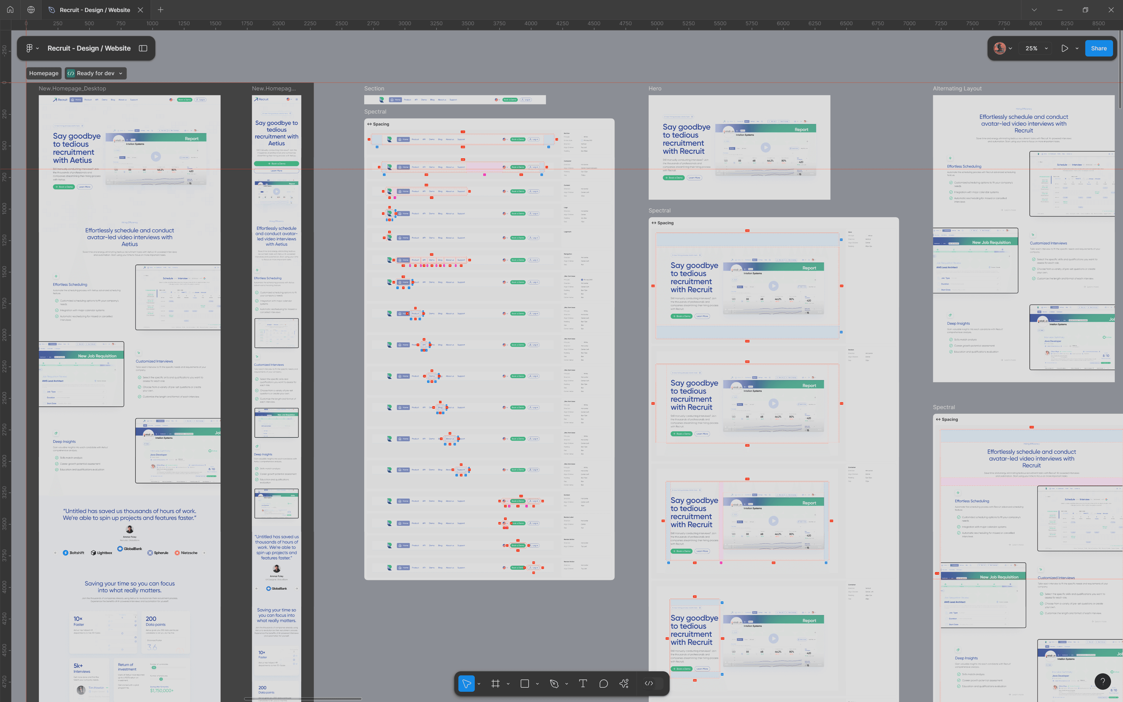
The assets handover process was executed to ensure a seamless transition from design to development. Using Figma, the primary tool employed throughout the project, high-fidelity wireframes, style guides, and all design and process assets were organized and shared with the client.
Project reflections and observations:


